|
October 1997 | Jacket 1 Contents | Homepage | Catalog | Search | Kurt BreretonCyberPoetics of Typography
Kurt Brereton teaches at the University of Technology Sydney, |
|
While Web designers and interface
designers share the computer screen their aesthetic concerns are different. Both
work with multimedia information displayed on monitors yet reading an
interactive CD is some distance away from the communication process of surfing
the net. The challenge for cyberpoets is to construct texts that utilise the
unique aesthetic qualities of hypermedia and interactive multimedia
communication environments. That is, cyberpoetry is a time based spatially
orientated, viewer/reader directed medium. |
The page is not a surface
The page is no longer a flat surface but a virtual
field unfolding in time. Words, sounds, images and graphics are now all part of
the poetics of the web. Web typography now allows a kinetic plasticity of form
not possible with the conventional printed page. Hot spot, image mapped words
talk back, sing along or free associate. Hyperlinked phrases now launch movies,
morph into animated graphics or clone themselves to infinity before your eyes.
In other words, the static graphic word has the ability to metamorphose
viral-like across media, across disciplines and genres. The gaze of the reader
is no longer directed from a singular fixed point of view. The reader is no
longer a Cartesian mind without a body contemplating the world from a reasoned
distance. The cybernetic poem directly involves the reader’s body in the
process of constructing
meaning. |
|
|
|
These ideas are not
new or even peculiar to the digital realm. Early modernists such as poet
Stéphane Mallarmé (1842–1898), Futurist and Dadaist artists like
Filippo Marinetti, Carlo Carra and Giacomo Balla all constructed noise-words,
exploring the graphic or concrete/semiotics interface of typography and meaning
(images). They went beyond the limiting salon and Academe conventions of making
sense. |
Software directed aesthetics
Cyberpoetics, from a typographical viewpoint, must
not be condemned solely to strategies of assemblage. At the moment, the vast
majority of authors are bound to use online fonts supplied by browser
applications and computer systems. Text must be treated as bitmapped image if it
wants to have any character beyond teletext. From a designers stance, the net,
is as clunky as a model T Ford. Modernist traditions of building a text up from
an internalised tissue of quotations has been overturned or externalised (even
reductively erased) by the advent of menu option aesthetics: filters, plugins,
applets and analog metaphors, all pose a real challenge for the cyberartist who
wants to create their own recipes rather than select from the sizzler menu of
predigested dishes. Cyber-aesthetics are driven by time based economics and
chastened by interactive habits learnt from USA military simulation and Timezone
entertainment technologies. |
Type in the timezone
Typography is also governed more by time (instantaneous
appearances) than by space. VR spatial techniques of ‘distancing’
and ‘levels of detail’ crash up against temporal dynamics of
download wait time and interlacing. Bit depth and monitor real estate
overcrowding, bandwidth and processing grunt all shape the use of typography.
Unlike the printed page, virtual and digital typography is in a constant state
of flux. User/viewer interactions in hyperlinking, screen hopping, scrolling,
resizing or changing viewing preferences render the reading process organic and
kinetic. The passive page is dead. The notion of type as dumb bearers of meaning
is also outdated. The graphic as trace is replaced by the graphic as organ,
active agent, generator of effects. Digital fonts are governed by protocols
rather than labour laws. |
Haptic Typography
Virtual typography is more haptic and aggregate than
optic or systematic in nature. That is, textual elements such as words, images,
objects exist in a field as discrete entities rather than as unified
arrangements in a spatial continuum. Animated avatars, photographic backgrounds,
3D rooms, floating objects or suspended words are all superimposed, or directed
much like cast members on a virtual 3D theatre stage. The movement of those cast
members is directed by the user at home in real time. |
Digital type has no body no body no body
Virtual texts have no
substance in any physical terms. In a strict semiotic sense, digital characters
don’t represent anything at all but themselves. Streaming texts, cascading
fonts or style sheets, non-linear modes of reading, gestural rephrasings and
media convergences all have upset the conventional ideas of graphic and textual
representation. Multiple Master (MM)
typefaces, that allow for variations between extremes such as weight, width or
optical weight have started to move towards flexible response
environments. Genetic Aesthetic
The cyberpoem is
open-ended in structure (if idea of structure is useful at all here?), and
certainly in appearance. Always becoming, cyberpoems are emergent, heterological
and heterogeneous in their constant spooling, transferences, hyperlinking and
recomposition. the poem has shifted from bricolage to morphosis. Cyberpoems are
not forged, mechanical or even electronic, they are genetic. Meaning has become
temporamental, stochastic and interpolated rather than causal or consequential.
Made of textual typographic fragments constantly moving into and out of focus,
resolution and degrees of proximity, the cyberpoem is more like an installation
or event than a document etched in metal or printed on paper. The reader
navigates through a sea of signs visiting information ports. There is no horizon
line and any scratched in reference to one is nostalgic since we see beyond what
the naked eye can see via satellites, microscopes, cable and data mirrors.
Hinting at Aesthetics
Great looking print
fonts don’t always look good on low resolution screens. Hinting is the
name for the set of techniques designed to restore an outline’s character
legibility. Small adjustments in the outline filling process (rasterisation) can
be made using programs such as
Fontographer or
FontLab to allow for low resolution
displays and small point sizes. Disappearing stems, lost hairlines and morphed
bowls are a hazard of using type on low resolution screens. Both
Postscript Type 1 and
TrueType fonts use hinting.
Postscript Type 3 fonts are
unhinted. |
|
|
|
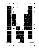
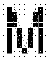
[Editor’s note: A full
explanation of the subtle art of
hinting is given on Microsoft’s
typography site at http://www.microsoft.com/typography/hinting/hinting.htm.
The diagrams above, showing (very much enlarged) how the character
‘Capital M’ in a sans serif font can be fitted on an eight by eleven
pixel grid in slightly different ways, are borrowed from that site, with thanks.
— John Tranter] |
|
|
|
|
Free Web Fonts
If you search the
web you will quickly find a myriad of free and saleable fonts and typefaces.
Designers who need to know that the fonts they are using are technically
accurate and character-complete usually buy from foundries. Freeware fonts are
fine for people wanting to knock up a web site and who don’t really care
if fonts a bit wonky or clunky. The new Microsoft fonts are the exception to
this rule. Microsoft’s free ‘core font’ selection (including
Comic, Georgia, Verdana and
Trebuchet MS, all downloadable at no
charge from http://www.microsoft.com/truetype/fontpack/default.htm)
seeks to widen the options for web designers beyond the usual meagre system
offerings. |
|
|
|
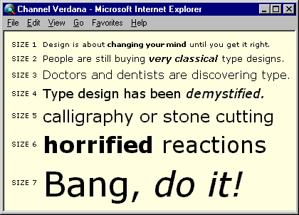
[Editor’s note: This is a screen shot of
some examples of Verdana, designed by Matthew Carter for Microsoft and
supplied with Microsoft Windows (graphic courtesy Microsoft’s typography site.)
Notice how the alphabetical characters actually change shape (the tail of the lower-case ‘g’ for
example) as they change size, the better to fit the pixel
grid. |
Open Type
Cross-platform font format Open Type is hailed as the
global answer to solving frustrating problems with Microsoft’s TrueType
and Adobe’sType1 Post Script font formats. The promise is that web
designers will be able to utilise high quality fonts that take less time to
render and display in documents. Positioning of glyphs, substitution and
alignment of characters and font security (digital signatures protecting changes
to form) are all special features in Open Type. Legible is not always readable
Legibility (how well a typeface supports the
process of fluent reading) and readability (the ease of reading continuous
blocks of text) both affect how the reader will respond to a text. Reading words
by their overall shape is faster than reading letter by letter. Larger x-height
typefaces are easier to read on screen. Reversed text can also affect reading
since the optical glare created by white letter forms on black background makes
characters appear to run together. Serif body copy reads better than sans serif
because the serifs aid the flow of the eye across words especially against
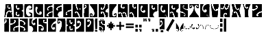
bright or coloured screen backgrounds. Psychedelia
Vitatype
digital fonts (at http://www.primenet.com/~jeffib/)
have produced the psychedelic set (Fillmore East, Fillmore West and Avalon) of
fonts inspired by 1960s USA music posters produced by artists such Family Dog
and Stanley Mouse. [sorry: dead link] |
|
|
|
VitaType font, Fillmore East,
1997 |
Cool Typography Sites
1. http://www.rsub.com/typo/(good all
round info and history) [sorry:dead link]
|
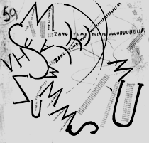
This is a poem.com
Kurt Brereton, Poem.com,
animation 1997 |
|
|
|
Start http://www.worldstudio.org
|
|
From Jacket’s editor, a link to collection of programs and resources for
the disassembly, reorganization, and reassembly of language... hopefully useful
for writers and experimentalists who want to jumpstart their creativity, or
otherwise wreck havoc upon an unsuspecting text: TextWorx
Toolshed. |
|
Jacket 1 — October 1997
Contents page This material is copyright © Kurt Brereton
and Jacket magazine 1997 |
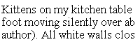
 A poorly hinted version of Times New Roman.